Adobe pueblos are NOT green!
Get the color right!
“Conversion is perversion!” In the era of custom film printing and pre-publication for offset printing, this axiom was drilled into my head by our photo lab techs. I knew what this meant in terms of photographic printing. Precise, matched color in photo series is the first must of any photo book producer, equally true for the museum collection, art monograph, or wedding book.
Color continuity is king.

Color continuity as intended of adobe building in snow
The fatally serious consequences of this statement didn’t register for me until I had to convert my Photoshop book images and design from ProPhoto RGB color space in Photoshop to Fogra39 or GRACol, or esoteric, proprietary subsets of these. Printing templates and gutters and cut margins are the easy part. Did I mention that wet and dry offset require quite different file preparations?
Ok, so what to do, how to advise others on their projects? Get the cart before the horse! Vet and choose your printer before finishing the imagery and design. Know their technical requirements and work from the start in their color space.
The monkey wrench in the works? What if you want the winter scene to look extra cold? Modify the color with emotion!
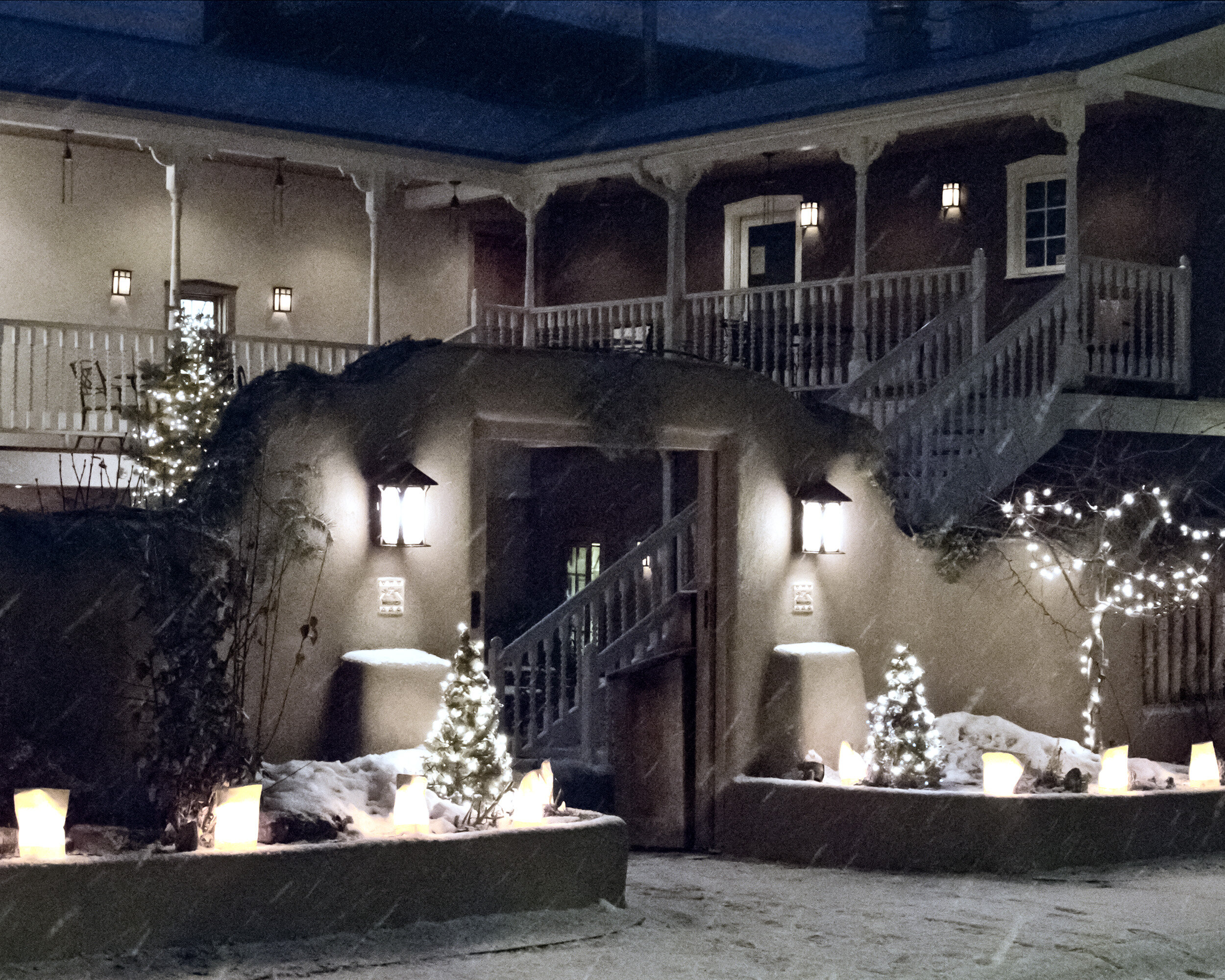
Winter scene of adobe building in snow looks much colder with blue color cast